
MTG Tracker has been updating a lot, usually UI changes are made gradually, but sometimes they are big. This update is one of the big ones, and I want to take the chance to look back to all the journey.
MTG Tracker UI journey
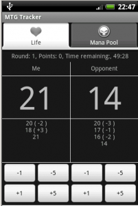
The app started with a single screen with a life counter for 2 players. Nothing really flashy. New features were added as tabs, Mana Pool, then Stats, then Decks. Tabs were cool on the early days of mobile apps.
 Then the ActionBar was presented, and with that, MTG Tracker moved to ActionBar + Dashboard. That is the other time the app had a considerable redesign.

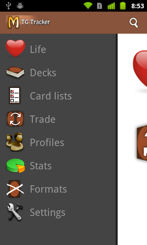
Moving forward, and adding features, at some point the app had so many features that a Dashboard was not enough. Also, a new pattern was emerging: Menu Drawers. So, we added one, not a big change, but still important.
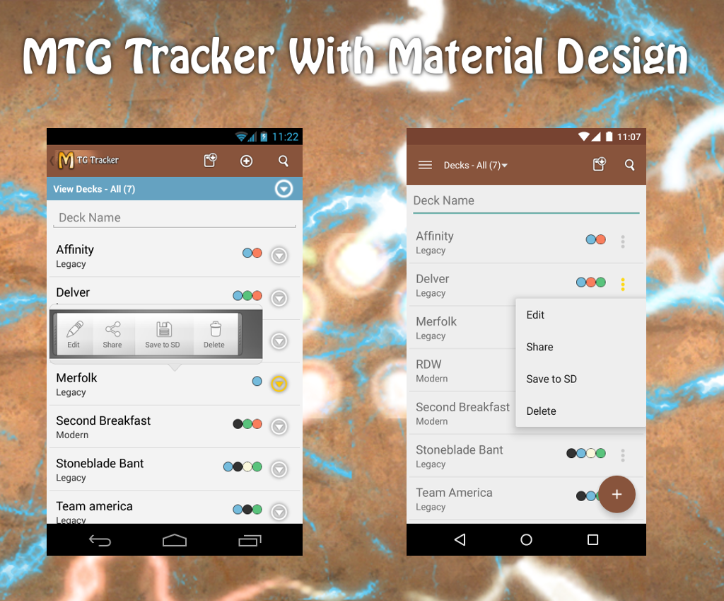
MTG Tracker with Material Design
And with this, we get to Material Design, the big push from Google with Lollipop. We are adopting quite some new patterns. An image is worth a thousand words.
Toolbar replaces ActionBar
The new toolbar has a more obvious drawer icon and the icon is removed from the bar, leaving some space for options and titles. It also has a very nice animation when opening the menu drawer.
There used to be a blue bar under the action bar for extra options on some screens. This is now part of the toolbar, giving am ore consistent look and feel.
Bonus points: Decks also have a Quick Return Header pattern, which hides part of the header when you scroll down and shows it again when you scroll up.
Floating Action Button
In most of the screens, there is a floating action button for the most prominent action (like add a new deck or add cards to a deck or a list).
Popup Menu replaces Quick Action Menu
The extra options for elements on a list were displayed with a quick action menu, which was cool when we started using it, but now everyone is moving to the popup menu with 3 dots, which is also more clean, so that has changed as well.
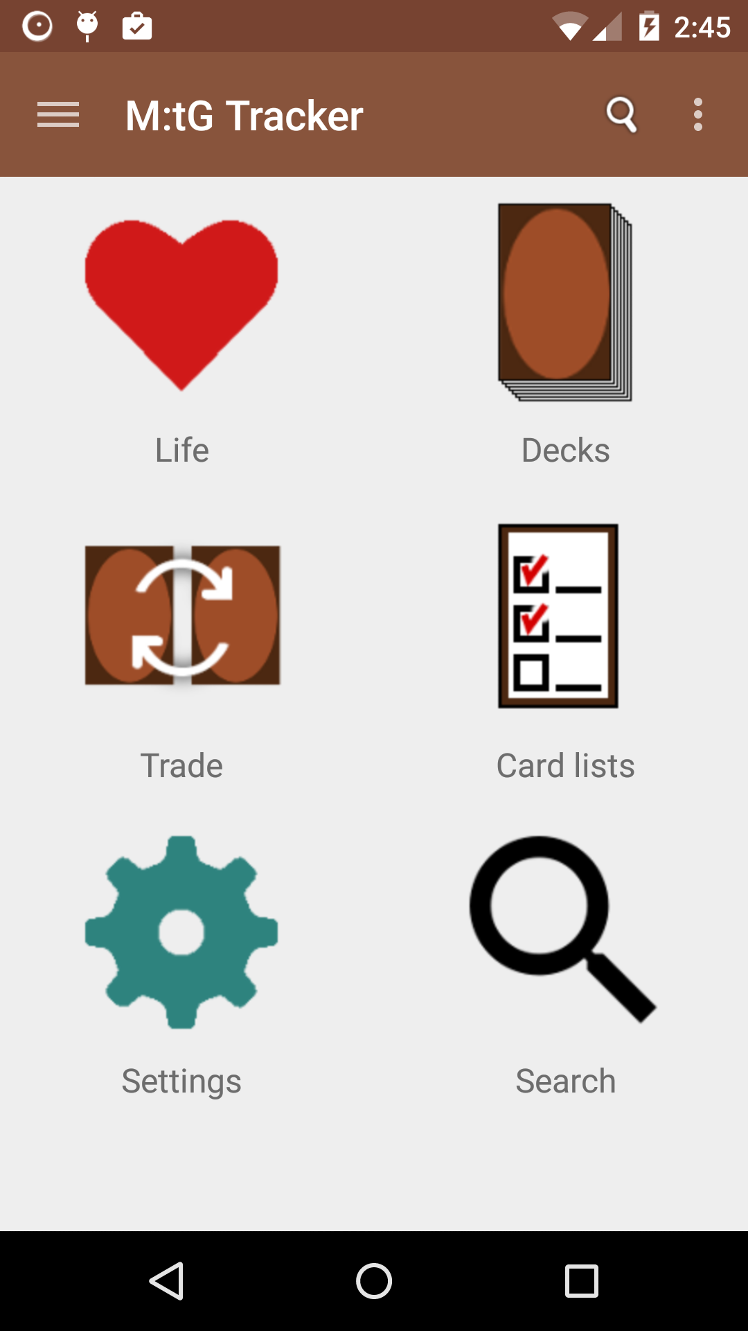
New simpler, cleaner icons
We also changed the icons of the home screen and the drawer to simpler, more clear versions of them.
Search is now an option on the menu drawer as well as in the main screen. It is much more accessible there than from the icon on the action bar.
Deck Edit is no more
Deck edit has disappeared. It was confusing and was not adding much value. The decks can be edited now at any time. As it was for Card Lists and Trades.
Something else?
I want to change some other parts of the user flow, but that will have to wait another update. No spoilers on that one.
But of course, there is a bit more:
- Added cards from Fate Reforged
- EDH banned list has been updated.
- Fixed a problem when adding the card “_______” to a deck or list.